Wednesday, 30 November 2011
Vis Comm
During the 3 lesson we started to look at font and how there are many ways of epxressing font via adobe illustrator. well we watched a clip on a introduction on designs and how to use it then we had a go at it ourselves just so we can get use to the idea so its easier for us to use towards the final stages.
Vis Comm
After deciding that i was going to do it based around the contrast realistic/unrealistic i needed to do some research and similar artist who relate their work to it. banksy a artist who does things which are very similar and creates images that a unrealistic and he creates the images from realistic views. his work was really inspiring as i looked at it and gave me a huge amount of ideas to think off.


after looking at his work i realised i wanted to create something similar to his work, but i wanted use something realistic so i decided i am going to focus on a even that happened not long ago which was the riots and maybe take some ideas from their to make them unrealistic.


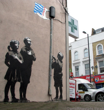
after looking at his work i realised i wanted to create something similar to his work, but i wanted use something realistic so i decided i am going to focus on a even that happened not long ago which was the riots and maybe take some ideas from their to make them unrealistic.
Vis Comm
As we brainstormed i looked into many ideas that i could possibly do. we told what we would be creating which was an image which relates back to the contrast. so after a fair bit of research i decided that i will stick to the contrast realistic/unrealistic.
Sunday, 27 November 2011
Vis Comm
In the first lesson once again we was told that our theme would be constrasts and we was explianed about what we would be producing within the area of work. we was told using our contrast we would have to make a double page spread of images.
so as a group we brainstormed some contrasts.
Gold/silver
fact/fiction
rich/poor
strong/weak.
so as a group we brainstormed some contrasts.
Gold/silver
fact/fiction
rich/poor
strong/weak.
Subscribe to:
Comments (Atom)